Z for Zonta.
Z for Sharpness.
Z for the End.

Alexander Zonta founded zDesignz in November 2017. He met Damon while specializing in Digitial Media at York University. Damon, who studies Computer Science at York University, helped shape zDesignz to the company it currently is today!
Alex and Damon began their company aspiring to Design, Create. They started with website design and development in 2017 and have expanded their company to the present day where they now do content creation, brand identity, logo design and much more!
Our Logo.
The progression of our logo has evolved over the 3 years:

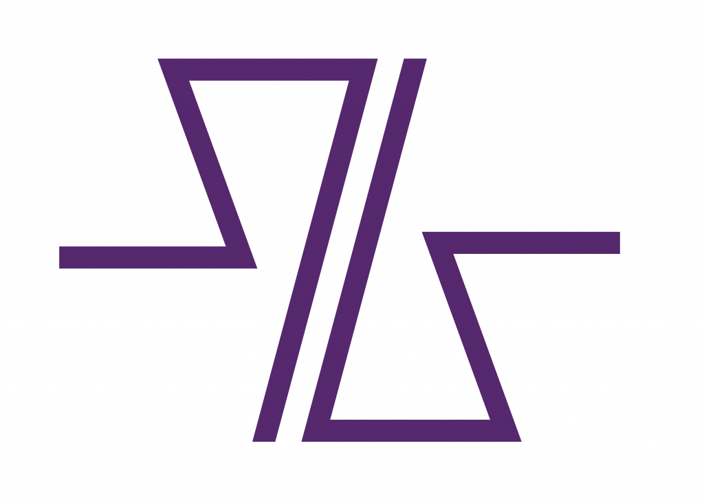
Our new and upgraded logo is comprised of one Z, with two reflected z’s on either side. Our decision to choose this logo, out of the many mockups we created, derived from our desire to have an ambiguous logo. Our logo doesn’t look like one symbol…it is totally open for interpretation!

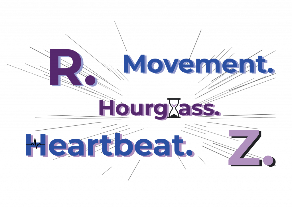
Our interpretation is this:

Reflected R: R for Rebranding, Recreating, Redesigning, Rebuilding.
Movement: The logo reminds us of movement. Speed. Point A to Point B. Here at zDesignz, our goal is to get you to where you want to be.
Heartbeat: It looks like a rhythm strip on an EKG machine, which is commonly known as a heartbeat. Our company aspires to bring your vision to life and keep your brand thriving and alive!
Hourglass: We look at work and the world with a glass half full, never half empty. Our hourglass is always half full. There is always room for improvement to move to a better future!
Z: Finally, our logo creates the shape of a Z. The last letter of the alphabet. Our end. The reverse z’s represent your end. Let us help your company and brand, from our end to yours!

